FoodRaccoon
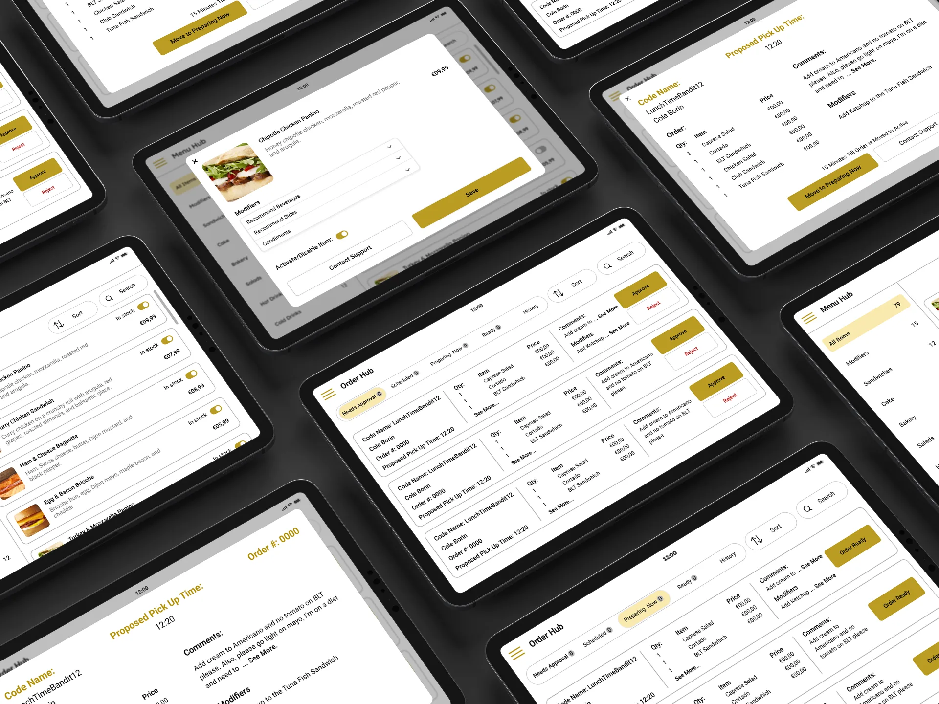
The tablet app restaurants use to take orders on a social takeout platform.
- Role
- Lead UI/UX Designer (contract)
- Timeline
- April to July 2023
- Platform
- Tablet app for restaurants
- Tools
- Figma
- Problem
- Restaurant staff, from a teenager on their first shift to a 60-year-old owner, had to handle orders in seconds with no training.
- My role
- I led three designers and worked alongside two developers. I owned the UX, the structure, and the visual direction.
- What I built
- The order hub, menu management, and the design system engineering built from.
- Result
- We delivered the MVP in the 3-month window, and the platform launched after my contract ended.
- What I'd change
- Better alerts for when orders spike.
- 27 screens
- 10 user tests in 2 rounds
- MVP in 3 months
Overview
FoodRaccoon is a German takeout platform with a social side. You can see where your friends are eating and send them a meal. My team designed the restaurant side, the tablet staff use to take and fill orders.
The users ranged from a 14-year-old on their first shift to an owner who had never used a tablet for work. That shaped every decision.
Problem
Most restaurant ordering tools are built by people who have never worked a dinner rush. They pack in features and slow you down. The client's first wireframes copied those tools.
Staff need to move an order in seconds. If someone couldn't figure it out in the middle of lunch, we'd failed. On top of that, EU rules for food ordering touched every screen that handled orders, prices, or customer data.
What I did
We checked the client's wireframes against how restaurants actually move an order through the kitchen. They treated orders like back-office paperwork. In a restaurant it's live, and it's urgent. So I rebuilt the structure around the order's path through the kitchen.
We tested with real restaurant workers across the whole age range, 10 tests over 2 rounds. Each round changed button sizes, how much went on a screen, and how order status worked.
What I built
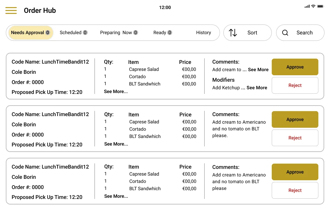
- Order hub. Tabs for Needs Approval, Scheduled, Preparing Now, Ready, and History, each with a count. That's how kitchens already think about orders. It also fixed the most common mistake in testing, which was losing track of an order in one long list.
- Order cards. Everything on one row, with big Approve and Reject buttons on the right, sized for a greasy screen.
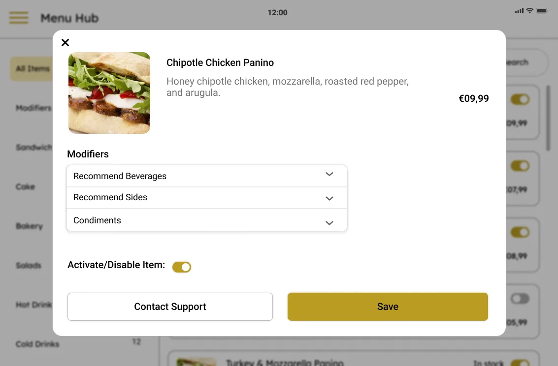
- Menu management. Categories, availability, modifiers, and prices. Item details open over the menu so you don't lose your place.
- Design system first. With engineering building in parallel, I built the component library before high-fidelity screens. It cut down the back-and-forth.
Results
We delivered the MVP in the 3-month window. Both the teenage employees and the older owners in testing finished the core tasks without help. Screens that handled orders and customer data met the EU requirements. FoodRaccoon launched after my contract ended.